Burndown is the estimated amount of work that remains to be done in an iteration, compared with the work originally estimated.
At any time, you can click on a planning folder and see how the sum of the estimated and remaining effort and points (story points) for all contained and descendant features is changing within a given time frame by choosing the options available in the View Mode. This helps you see how the estimates for your features are changing from day to day, and how the team is progressing towards "done".
You can use the trend line shown in your burndown chart to do some useful things:
- Project the time when all the work for this iteration will be completed.
- Predict the amount of work your team can expect to complete during any given iteration. (This is known as your team's velocity.) You can see the velocity based on efforts in the planning folder's summary section.
The information you derive from your burndown chart will help revise the product scope, make accurate planning decisions, and refine implementation details.
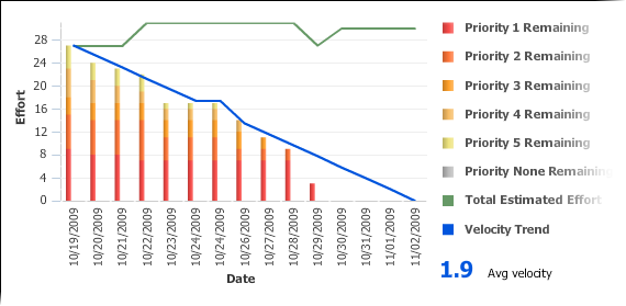
In general, a burndown chart trends downward until it reaches zero. In practice, some events can reverse the downward trend of your burndown chart. For example, development work frequently uncovers a greater scope for a user story than was initially estimated. As a result, you'll revise your estimate of remaining work on that story, and your burndown figure may be pushed upwards.
The burndown chart uses whatever effort units you are using in the planning folder.